internship project
internship project
Increasing the completion rate of editing a job posting on Indeed.com
Increasing the completion rate of editing a job posting on Indeed.com
Role
UX Design, User Research, Usability Testing, Prototyping
Timeline
June 2022 - September 2022
Tools
Figma, UserTesting.com, Jira,
Google Workspace
Role
UX Design, User Research, Usability Testing, Prototyping
Tools
Figma, UserTesting.com, Jira,
Google Workspace
Timeline
June 2022 - September 2022
Role
UX Design, User Research, Usability Testing, Prototyping
Tools
Figma, UserTesting.com, Jira, Google Workspace
Timeline
June 2022 - September 2022


✦ overview
✦ overview
✦ overview
As a UX design intern at Indeed, I resolved a major pain point where users expressed frustration with lost job posting details due to edits not saving. Collaborating with cross-functional teams, I researched, designed, and tested solutions that significantly increased the completion rate of job post edits, making the process less frustrating and more error-free.
As a UX design intern at Indeed, I resolved a major pain point where users expressed frustration with lost job posting details due to edits not saving. Collaborating with cross-functional teams, I researched, designed, and tested solutions that significantly increased the completion rate of job post edits, making the process less frustrating and more error-free.
1. Discover
1. Discover
User research, Usability testing, Comparative analysis
User research, Usability testing, Comparative analysis
2. Design
2. Design
Design exploration, High-fidelity prototyping
Design exploration, High-fidelity prototyping
3. Test
3. Test
Usability testing, Design iteration
Usability testing, Design iteration
4. Implement
4. Implement
Documentation, Developer handoff,
A/B testing
Documentation, Developer handoff, A/B testing
Documentation, Developer handoff, A/B testing
✦ the problem
✦ the problem
Users are facing difficulties saving edits to their job postings.
Despite surveys expressing frustration with unsaved edits, a thorough analysis by engineers revealed no technical issues. Instead, it was theorized that users were not clicking the "Confirm" button, the final confirmation, at the bottom of the page before exiting, resulting in their changes being discarded.
hypothesis
hypothesis
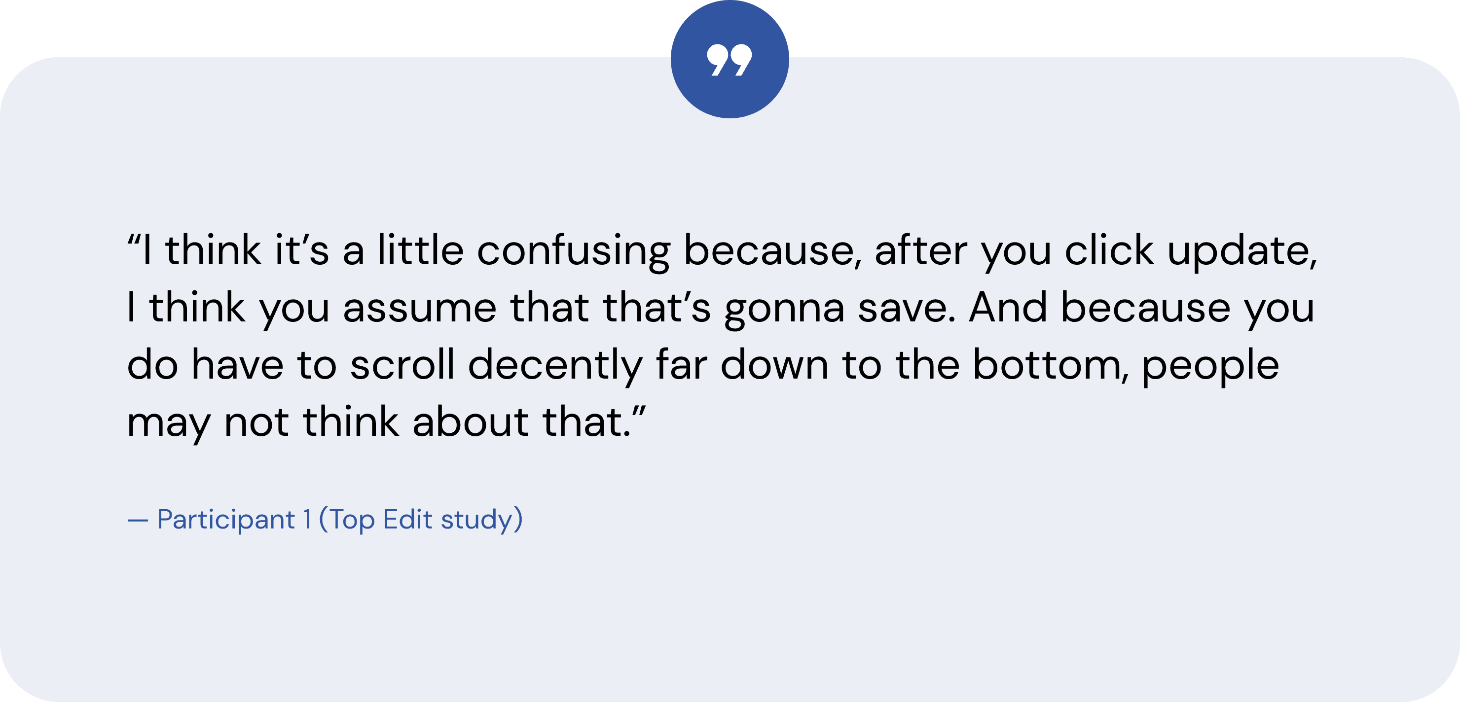
Users believe the “Update” button on pop-up modals saves their changes, so they don’t look for the final confirmation button which is concealed by a long scroll to the bottom of the page.
Users believe the “Update” button on pop-up modals saves their changes, so they don’t look for the final confirmation button which is concealed by a long scroll to the bottom of the page.
✦ our solutions
✦ our solutions
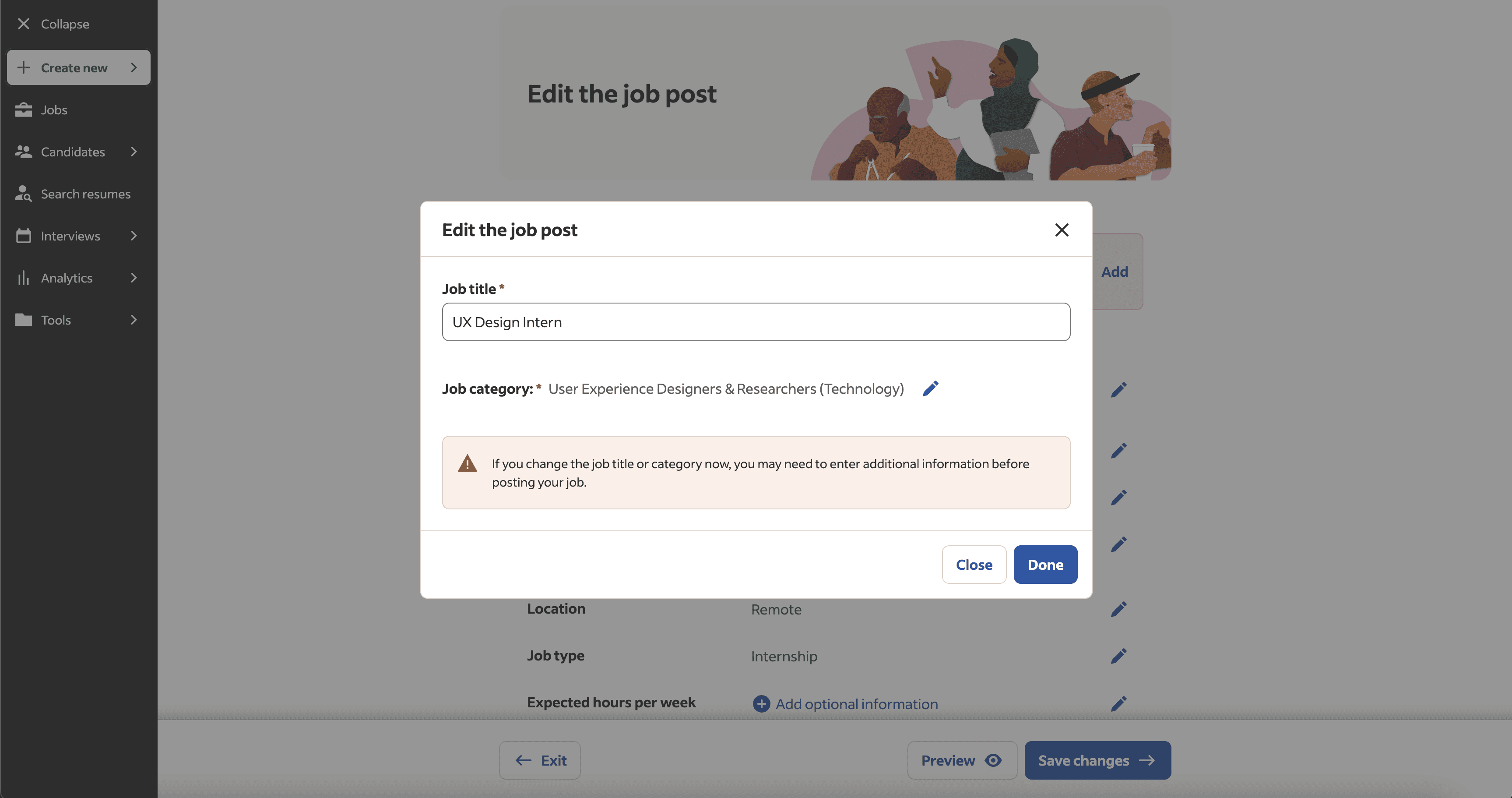
Moving button location
Moving button location
Anchoring the final confirmation button to the bottom of the screen using a sticky footer
Anchoring the final confirmation button to the bottom of the screen using a sticky footer


Changing button verbiage
Changing button verbiage
Changing the name of the buttons to better correspond with
their function
Changing the name of the buttons to better correspond with their function
Changing the name of the buttons to better correspond with their function
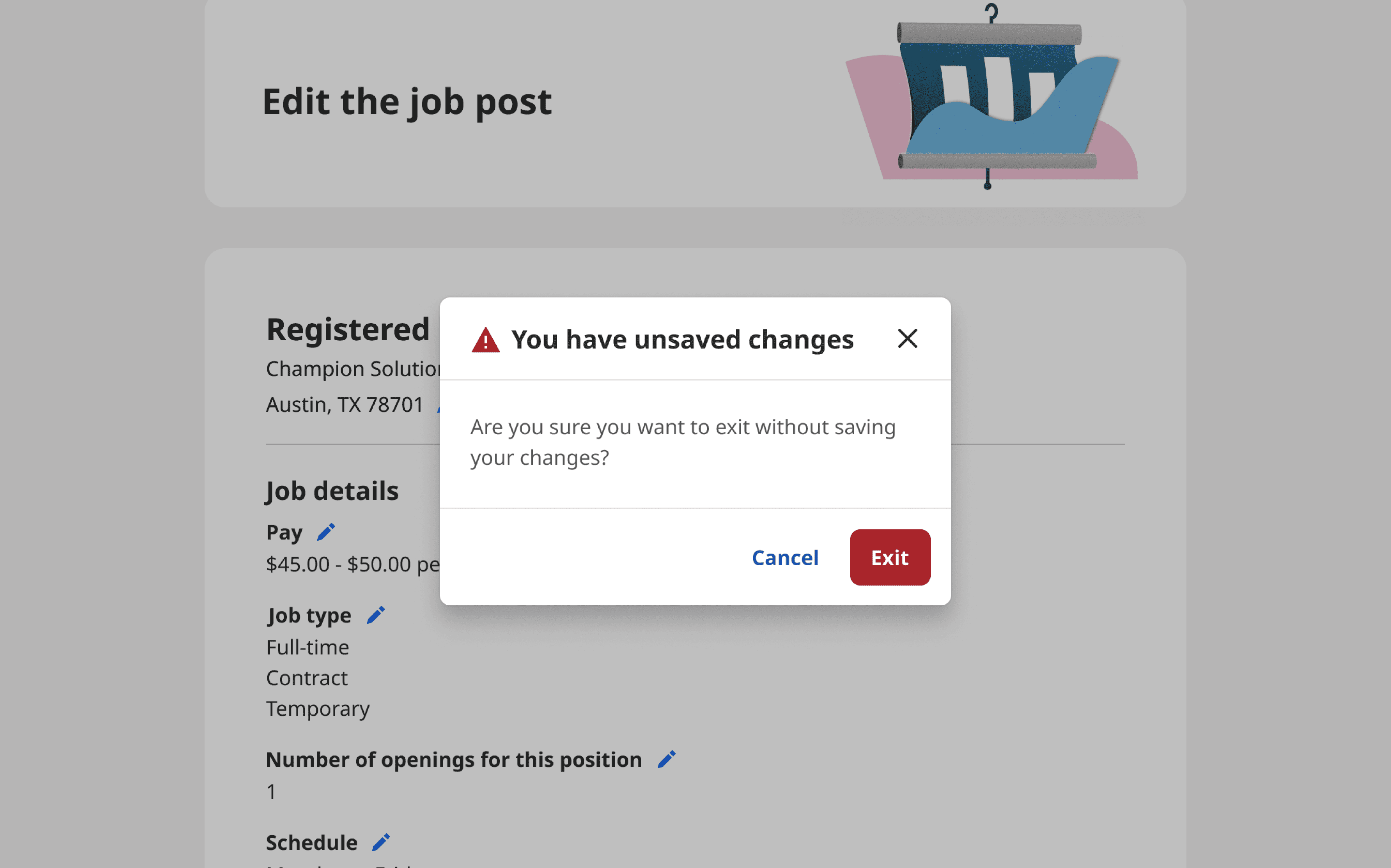


Implementing error prevention
Implementing error prevention
Implementing a warning to prevent users from unknowingly discarding their edits
Implementing a warning to prevent users from unknowingly discarding their edits
✦ discover
✦ discover
Indeed uses different verbiage for their buttons compared to their competitors in editing experiences.
Our initial thought was to rename the final confirmation button and change its location, so we conducted research to validate this direction.
The key highlights of my comparative analysis were
All competitors used "Save" or "Save changes", while Indeed used "Confirm"
The locations of these buttons vary between the top of the page and the bottom, with a few being anchored
Based on my findings, the location of the button may not be a significant issue, however, the verbiage differed from industry standard.
Indeed uses different verbiage for their buttons compared to their competitors in editing experiences.
Our initial thought was to rename the final confirmation button and change its location, so we conducted research to validate this direction.
The key highlights of my comparative analysis were:
All competitors used "Save" or "Save changes", while Indeed used "Confirm"
The locations of these buttons vary between the top of the page and the bottom, with a few being anchored
Based on my findings, the location of the button may not be a significant issue, however, the verbiage differed from industry standard.
Indeed uses different verbiage for their buttons compared to their competitors in editing experiences.
Our initial thought was to rename the final confirmation button and change its location, so we conducted research to validate this direction.
The key highlights of my comparative analysis were
All competitors used "Save" or "Save changes", while Indeed used "Confirm"
The locations of these buttons vary between the top of the page and the bottom, with a few being anchored
Based on my findings, the location of the button may not be a significant issue, however, the verbiage differed from industry standard.


To further validate our hypothesis, I collaborated with a UX researcher to develop a research plan to analyze user interactions on the job editing page.
To further validate our hypothesis, I collaborated with a UX researcher to develop a research plan to analyze user interactions on the job editing page.
TOOL
TOOL
TOOL
UserTesting.com
UserTesting.com
UserTesting.com
TEST TYPE
Unmoderated,
between-subjects study
Unmoderated,
between-subjects study
PARTICIPANTS
16 participants
(8 per group)
16 participants
(8 per group)
TASK
Enter the job post editor, make an edit either near the top or bottom of the page, and return to the job dashboard
Enter the job post editor, make an edit either near the top or bottom of the page, and return to the job dashboard
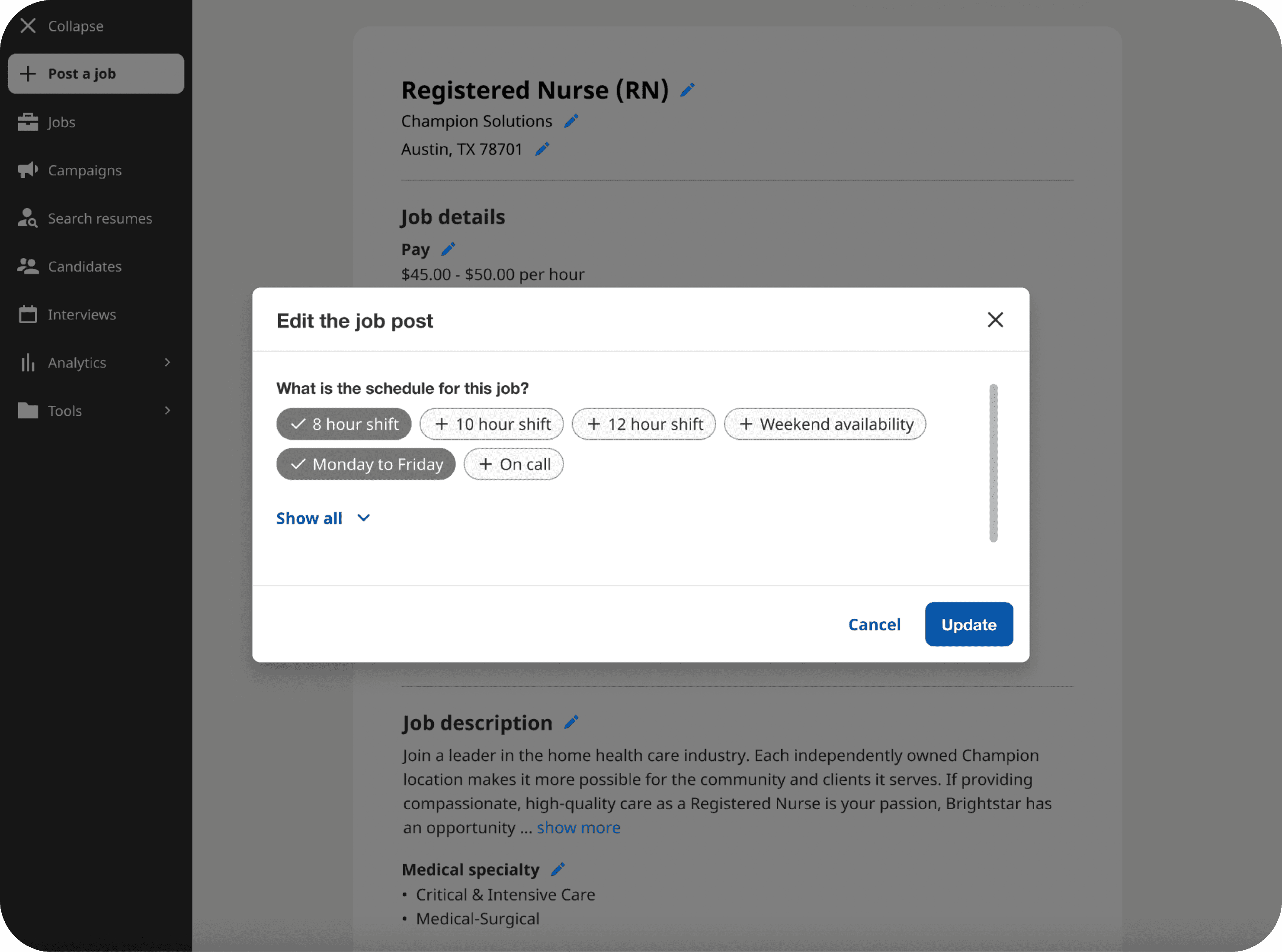


Top Edit study
Top Edit study
The Top Edit group was instructed to make an edit near the top of the page where the "Confirm" button would not be in their view to determine whether users would press the button when they couldn’t see it while accomplishing their task.
The Top Edit group was instructed to make an edit near the top of the page where the "Confirm" button would not be in their view to determine whether users would press the button when they couldn’t see it while accomplishing their task.
Bottom Edit study
Bottom Edit study
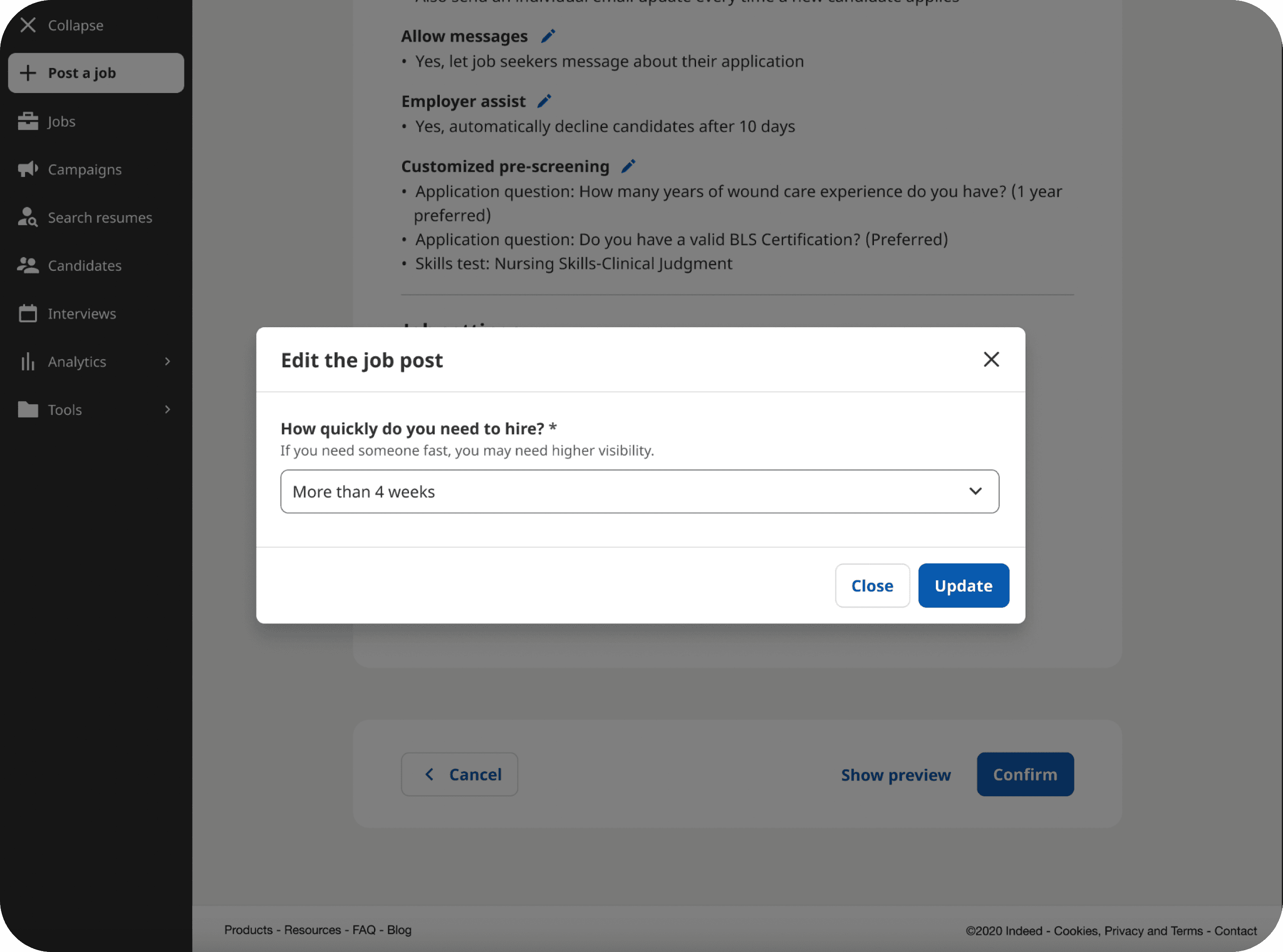
The Bottom Edit group was instructed to perform the same tasks, but their edit was located near the bottom of the page where the "Confirm" button would be inside their viewport to determine whether users were more likely to press the button when they could see it while accomplishing their task.
The Bottom Edit group was instructed to perform the same tasks, but their edit was located near the bottom of the page where the "Confirm" button would be inside their viewport to determine whether users were more likely to press the button when they could see it while accomplishing their task.


88%
88%
of participants clicked the “Confirm” button when it was within sight
of participants clicked the “Confirm” button when it was within sight
of participants clicked the “Confirm” button when it was within sight
63%
63%
of participants clicked the “Confirm” button when it was not within sight
of participants clicked the “Confirm” button when it was not within sight


key finding #1
key finding #1
Participants were more likely to click the “Confirm” button when it was within their sight.
Participants were more likely to click the “Confirm” button when it was within their sight.
More participants in the Bottom Edit group clicked the “Confirm” button and successfully saved their edits than in the Top Edit group.
More participants in the Bottom Edit group clicked the “Confirm” button and successfully saved their edits than in the Top Edit group.
key finding #2
key finding #2
The verbiage for the “Confirm” button wasn’t clear to some participants.
The verbiage for the “Confirm” button wasn’t clear to some participants.
The verbiage for the “Confirm” button wasn’t clear to some participants.
The verbiage for the “Confirm” button wasn’t clear to some participants.
Participants said they expected to see different verbiage instead of “Confirm”. They said it would be clearer to use “Save changes” or “Update”.
Participants said they expected to see different verbiage instead of “Confirm”. They said it would be clearer to use “Save changes” or “Update”.
key finding #3
key finding #3
The “Update” button on the pop-up modal was misleading.
The “Update” button on the pop-up modal was misleading.
The “Update” button on the pop-up modal was misleading.
The “Update” button on the pop-up modal was misleading.
Majority of participants in both groups stated that they believed their edits were saved when they clicked the “Update” button.
Majority of participants in both groups stated that they believed their edits were saved when they clicked the “Update” button.
✦ design
✦ design


Renamed the buttons from “Confirm” and “Cancel” to “Save changes” and “Exit” to better correspond with their function and match the users’ expectations
Renamed the buttons from “Confirm” and “Cancel” to “Save changes” and “Exit” to better correspond with their function and match the users’ expectations
Renamed the buttons from “Confirm” and “Cancel” to “Save changes” and “Exit” to better correspond with their function and match the users’ expectations
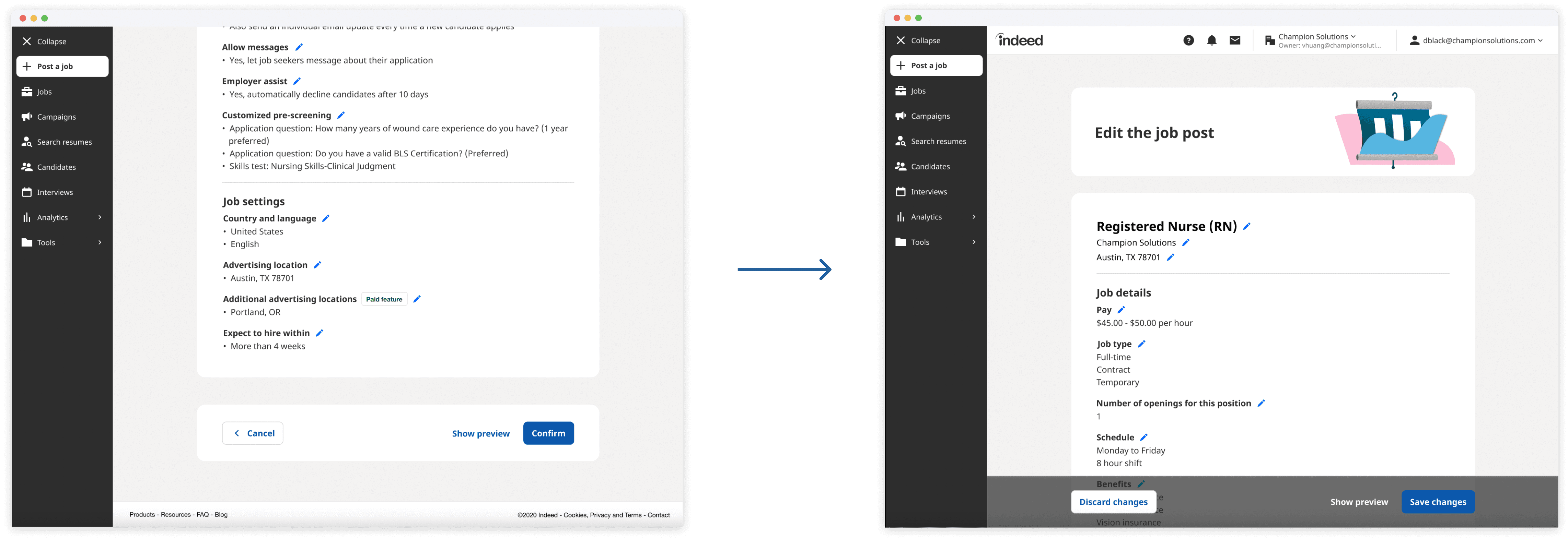


Moved the final confirmation button from the bottom of the page to be anchored to the bottom of the users’ screen, in order to keep the button within their sight
Moved the final confirmation button from the bottom of the page to be anchored to the bottom of the users’ screen, in order to keep the button within their sight
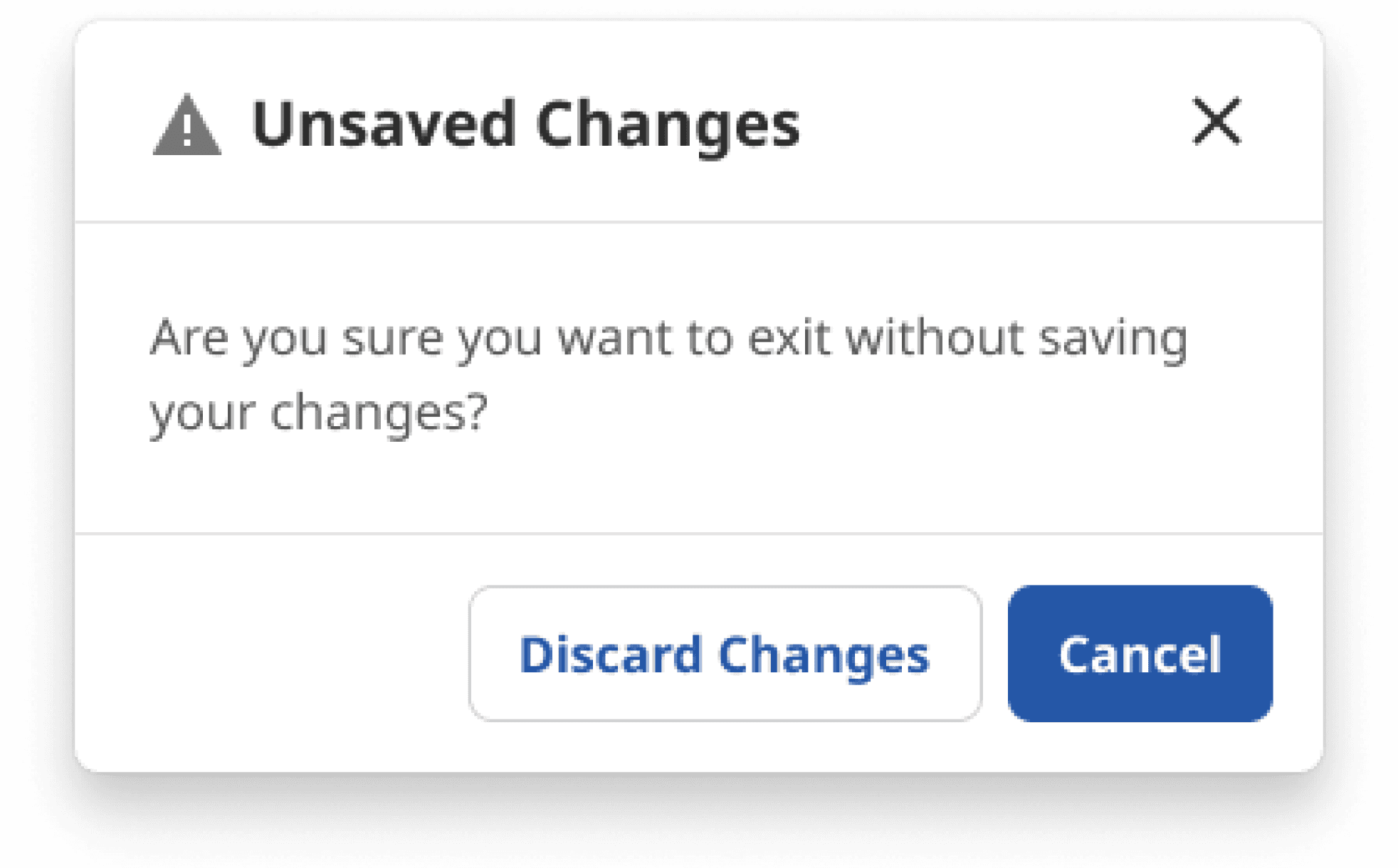

Designed a pop-up that alerts users of unsaved changes if they attempt to leave without saving their changes to warn users and prevent potential errors
Designed a pop-up that alerts users of unsaved changes if they attempt to leave without saving their changes to warn users and prevent potential errors
✦ test
✦ test
✦ test
Participants were more successful in saving their edits with our new solutions than in the control study.
We conducted usability testing under the same parameters as our initial study on 8 new participants.
We found that:
Participants were more successful in saving their edits with the new design when making an edit near the top of the page than in the Top Edit study
Interacting with the saved changes alert helped lead participants to the “Save changes” button
Participants still found the “Update” button on the pop-up modals misleading
Participants were more successful in saving their edits with our new solutions than in the control study.
We conducted usability testing under the same parameters as our initial study on 8 new participants.
We found that:
Participants were more successful in saving their edits with the new design when making an edit near the top of the page than in the Top Edit study
Interacting with the saved changes alert helped lead participants to the “Save changes” button
Participants still found the “Update” button on the
pop-up modals misleading


We changed the “Update” button to “Done” so that its name better corresponds to its function.
We changed the “Update” button to “Done” so that its name better corresponds to its function.


We collaborated with a content designer to ensure design and verbiage aligns with Indeed’s brand system.
We collaborated with a content designer to ensure design and verbiage aligns with Indeed’s brand system.
Please note that some design elements in this case study may differ slightly from the current live experience due to a post-project redesign of the job posting experience.
Please note that some design elements in this case study may differ slightly from the current live experience due to a post-project redesign of the job posting experience.
✦ implement
✦ implement
We successfully pitched our design solutions to the product manager, engineering lead, and leadership, receiving the green light to begin implementation.
While implementation occurred after my internship, I still played a crucial role in paving the way for success. To create a smooth handover for the engineers, I created documentation on Jira and Google Docs to detail each solution's navigation, design nuances, and various state behaviors.
✦ implement
We successfully pitched our design solutions to the product manager, engineering lead, and leadership, receiving the green light to begin implementation.
While implementation occurred after my internship, I still played a crucial role in paving the way for success. To create a smooth handover for the engineers, I created documentation on Jira and Google Docs to detail each solution's navigation, design nuances, and various state behaviors.
impact
impact
Changes to button verbiage and the implementation of a sticky footer yielded significant increases to the completion rate of job edits.
Changes to button verbiage and the implementation of a sticky footer yielded significant increases to the completion rate of job edits.
Changes to button verbiage and the implementation of a sticky footer yielded significant increases to the completion rate of job edits.
After receiving positive results from A/B testing, our designs were fully implemented on Indeed.com which resulted in a substantial increase in the rate of users successfully saving their job edits. While specific metrics remain confidential, I’m happy to share that the changes proved highly impactful, directly benefiting both users and the platform.
After receiving positive results from A/B testing, our designs were fully implemented on Indeed.com which resulted in a substantial increase in the rate of users successfully saving their job edits. While specific metrics remain confidential, I’m happy to share that the changes proved highly impactful, directly benefiting both users and the platform.
impact
Changes to button verbiage and the implementation of a sticky footer yielded significant increases to the completion rate of job edits.
After receiving positive results from A/B testing, our designs were fully implemented on Indeed.com which resulted in a substantial increase in the rate of users successfully saving their job edits. While specific metrics remain confidential, I’m happy to share that the changes proved highly impactful, directly benefiting both users and the platform.
✦ learnings & takeaways
✦ learnings & takeaways
01
01
Stronger research
and analysis skills
Stronger research and analysis skills
Stronger research and analysis skills
Gained a deeper understanding of how to build an effective research plan by collaborating with UX researchers to design unbiased questions and tasks, giving us a more realistic insight into how users interact with our product.
Gained a deeper understanding of how to build an effective research plan by collaborating with UX researchers to design unbiased questions and tasks, giving us a more realistic insight into how users interact with our product.
02
02
Importance of user
research
Importance of user research
Importance of user research
Conducting user research early helped me identify why users were having difficulty saving their edits, leading us to our solution which significantly increased job edit completion rates.
Conducting user research early helped me identify why users were having difficulty saving their edits, leading us to our solution which significantly increased job edit completion rates.
Conducting user research early helped me identify why users were having difficulty saving their edits, leading us to our solution which significantly increased job edit completion rates.
˚ ༘♡ ·˚ Thanks for reading ₊˚ˑ ˚
˚ ༘♡ ·˚ Thanks for reading ₊˚ˑ ˚
Wanna see more? View some of my other projects!
Wanna see more?
View some of my other projects!
next project →

